Ucha.se
Ucha.se
Ucha.se is the biggest education platform in Bulgaria, with over 1 million users and numerous schools across the country. The platform includes short video lessons that explain the school material in a fun, simple and easy-to-understand language.
Ucha.se is the biggest education platform in Bulgaria, with over 1 million users and numerous schools across the country. The platform includes short video lessons that explain the school material in a fun, simple and easy-to-understand language.
Designed at Despark
Brand and illustrations by Dimitar Chikakchiev
Challenge
Ucha.se had a million users, lessons people genuinely valued, and a churn problem it couldn't shift. Less active users watched few videos, solved fewer tests, and quietly stopped renewing — which meant growth stalled year on year. The team came to us for a modern, teen-friendly redesign of the web platform and a new mobile app.
Strategy
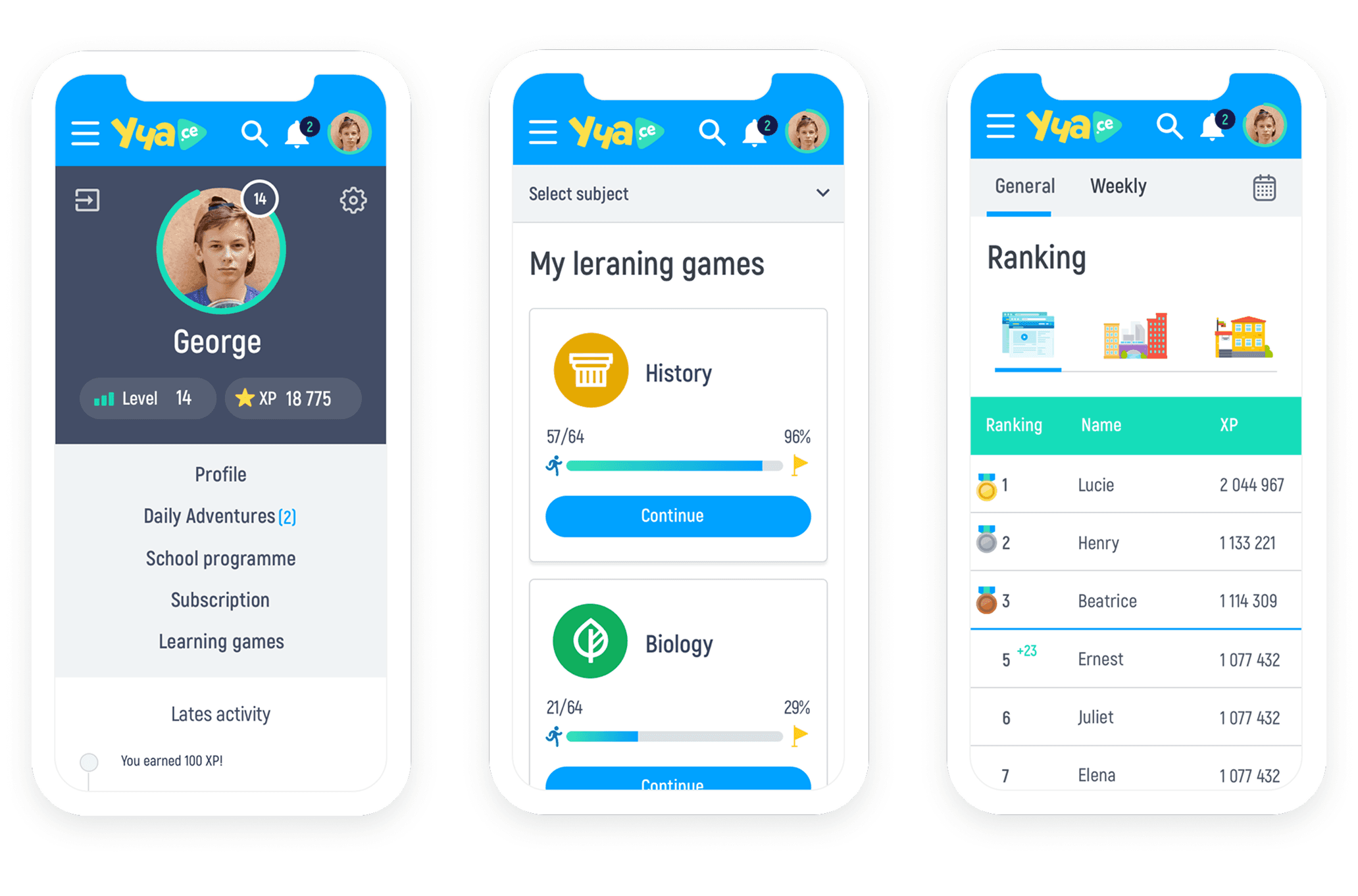
I audited the platform, then spent time with 25+ students and 10+ teachers — and the sharpest finding had nothing to do with looks: learners couldn't tell which video matched the lesson in their textbook. So the work started underneath. New information architecture, textbook-aligned lesson ordering, and a design system built on the new brand — with the playful character moved into a mascot so the interface itself could grow up. Priority guides first, wireframes second, visual design last.
Outcome
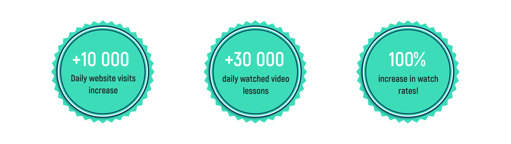
I was responsible for UX and UI across the project — which meant deciding what the platform's structure should be, not just how it looked. The textbook alignment, the reworked lesson-to-test flow, and the design system that carried the new brand into every screen were mine. Daily video lessons watched doubled in the year after launch, from 30,000 to over 60,000, with daily visits up from 20,000 to 30,000.






Challenge
Ucha.se had a million users, lessons people genuinely valued, and a churn problem it couldn't shift. Less active users watched few videos, solved fewer tests, and quietly stopped renewing — which meant growth stalled year on year. The team came to us for a modern, teen-friendly redesign of the web platform and a new mobile app.
Strategy
I audited the platform, then spent time with 25+ students and 10+ teachers — and the sharpest finding had nothing to do with looks: learners couldn't tell which video matched the lesson in their textbook. So the work started underneath. New information architecture, textbook-aligned lesson ordering, and a design system built on the new brand — with the playful character moved into a mascot so the interface itself could grow up. Priority guides first, wireframes second, visual design last.
Outcome
I was responsible for UX and UI across the project — which meant deciding what the platform's structure should be, not just how it looked. The textbook alignment, the reworked lesson-to-test flow, and the design system that carried the new brand into every screen were mine. Daily video lessons watched doubled in the year after launch, from 30,000 to over 60,000, with daily visits up from 20,000 to 30,000.
© 2026 Design and code by Daniel Prashtilsky.