Chaos
Chaos
Chaos develops design and visualisation technology for architecture, engineering, construction, product design, manufacturing, and media and entertainment. Its flagship renderer, V-Ray, has an Academy Award and an Engineering Emmy — and its users judge images for a living.
Chaos develops design and visualisation technology for architecture, engineering, construction, product design, manufacturing, and media and entertainment. Its flagship renderer, V-Ray, has an Academy Award and an Engineering Emmy — and its users judge images for a living.
Designed at Despark
Challenge
The product is invisible. Nobody buys a renderer for the renderer — they buy what it lets them make, and the proof is in other people's work. So the site had to sell an outcome rather than a feature set, in front of an audience that assesses visual quality for a living and notices every compromise.
Strategy
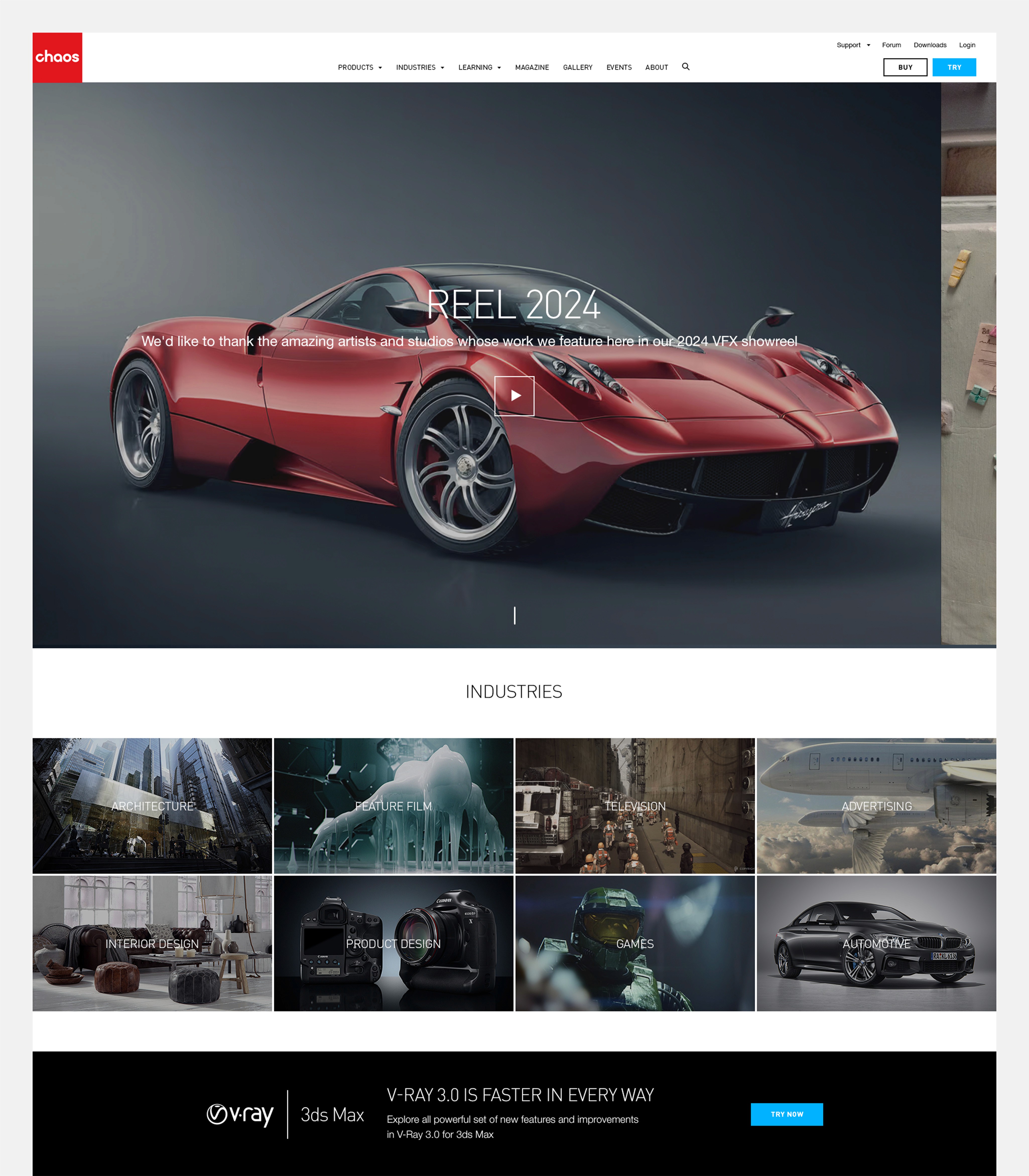
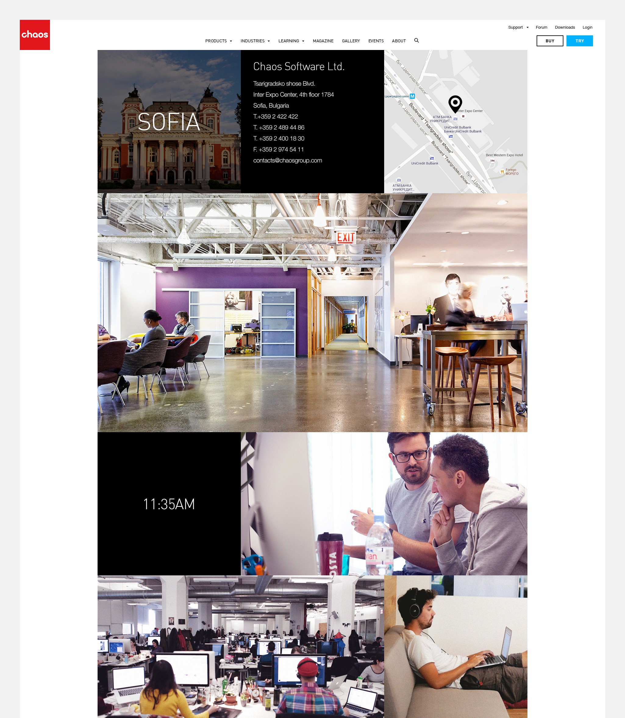
The work of the users leads; everything else steps back. I built the layouts around full-bleed imagery and gave the interface as little presence as it could have while still being navigable — restrained type, quiet structure, generous space, nothing decorative competing with a render. The design system had to hold the same discipline across a wide product range: consistent enough to feel like one company, neutral enough that each product's imagery sets the tone of its own page.
Outcome
What shipped was a calmer, more legible site — products organised so people can find the one that fits their pipeline, and a visual language built to stay in the background. I was responsible for UX and interface design across the project.


Challenge
The product is invisible. Nobody buys a renderer for the renderer — they buy what it lets them make, and the proof is in other people's work. So the site had to sell an outcome rather than a feature set, in front of an audience that assesses visual quality for a living and notices every compromise.
Strategy
The work of the users leads; everything else steps back. I built the layouts around full-bleed imagery and gave the interface as little presence as it could have while still being navigable — restrained type, quiet structure, generous space, nothing decorative competing with a render. The design system had to hold the same discipline across a wide product range: consistent enough to feel like one company, neutral enough that each product's imagery sets the tone of its own page.
Outcome
What shipped was a calmer, more legible site — products organised so people can find the one that fits their pipeline, and a visual language built to stay in the background. I was responsible for UX and interface design across the project.
© 2026 Design and code by Daniel Prashtilsky.